Bp VIP.net includes a graphing tool for creating line graphs that show changes in patient history data over time. Up to four different series can be plotted on one graph, and you can display two graphs in the same view. Graphing functionality includes:
- Checkbox and pick list values can be plotted over time alongside data points (for example, to indicate change before and after intervention).
- You can include links to relevant patient history items at data points (for example, an Rx was written, or an operation performed).
- You can plot high and low ranges for a series in a graph, for a visual indication of a series' path in an acceptable range.
Insert a graph in a UDF
- Click
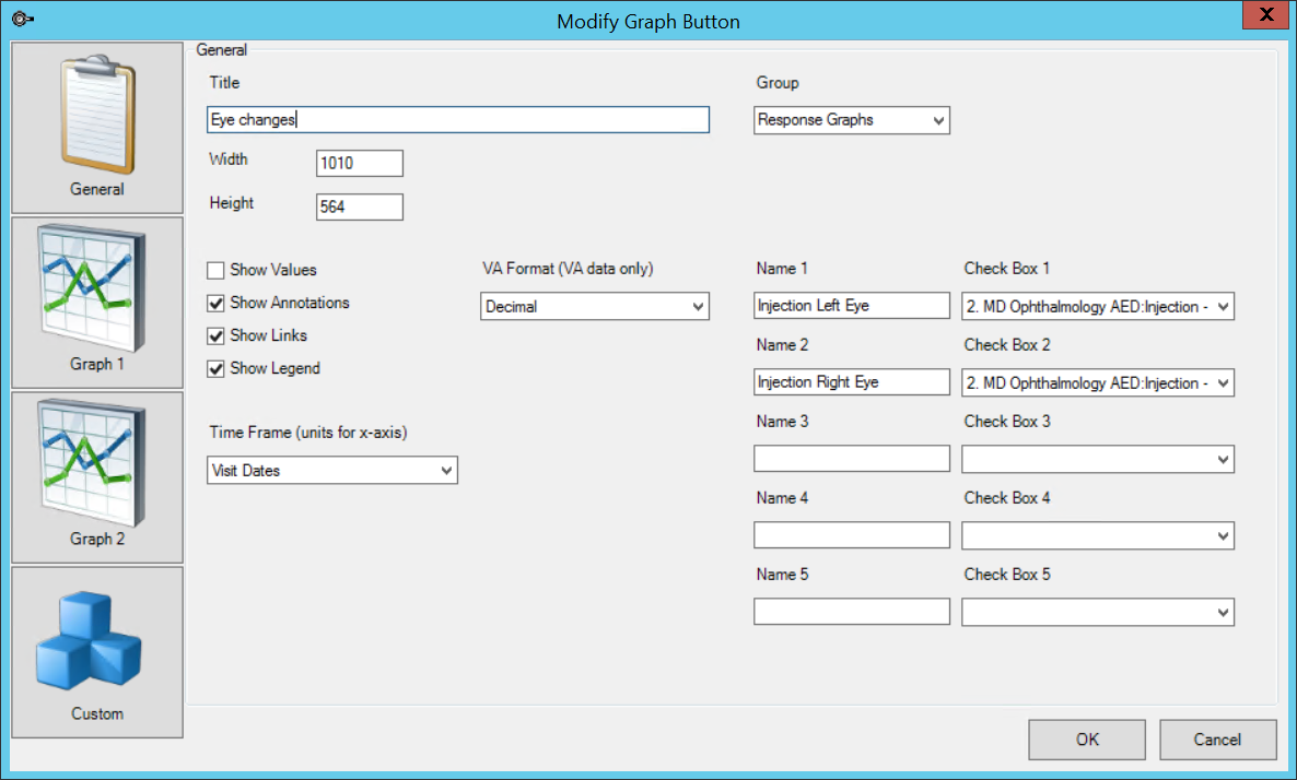
 on the Form Designer toolbar. The Modify Graph Button screen will appear.
 - Enter a Title for the graph. The title will be displayed at the top of the graph.
- Enter a Width and Height for the graph size.
- Select the Group to assign the graph to, if any. See Grouping fields on a UDF for more information.
- Select the items to display on the graph by default:
- Values — Show the numeric values of data points.
- Annotations — Show any notes made on the graph. To enter a note, left-click on a data point.
- Links — Show links to related items from patient history, if any, that coincide with data points. Links will be inserted along the top of the graph.
- Legend — Show the graph legend.
- If you are graphing Visual Acuity fields, select a VA format to use for all VA data. Bp VIP.net will convert any data recorded in other formats.
- Select the Time Frame over which to show data. The default, 'Visit Dates,' is the most common time frame. If you select Days, Weeks, or Months, select a date value to Start From and the Start on and Number of fields.
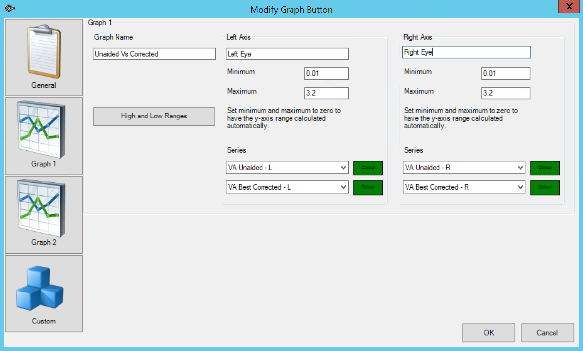
- Select the Graph 1 tab.
- The Graph Name will indicate which line corresponds to Graph 1.
- By default, the y-axis for graphs is scaled automatically based on the highest and lowest values for the series from patient data. Enter Minimum and Maximum values to scale the left or right axes to user-defined values.
- Select up to two fields to populate the graph Series for the left and right axes. Select a Colour for the series line.
- If you want to plot data for additional Series, select the Graph 2 tab and complete the fields.
- Click OK to save the graph and insert the graph button into the UDF. When the user clicks the graph button, the graph will be displayed in a viewer.


Graph an intervention
You can indicate the value of checkboxes and pick lists at data points. For example, you could indicate whether an injection was administered throughout a series, when a patient quit smoking, or how intraocular pressure was measured.
The checkbox or pick list value is indicated along the top of the graph at each data point.
Graph checkbox values
- Open the Modify Graph Button screen for the graph.
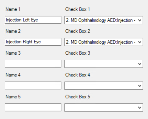
- The five Name and Check Box fields on the right hand side indicate the checkbox values to include on the graph.
- In the example, two checkbox fields have been added: 'Injection - Right' and 'Injection - Left'. When the graph is displayed to the user, a row along the top of the graph will indicate whether these checkboxes were ticked or unticked at each data point.
- Click OK to save the graph.

Graph pick list values
- Open the Modify Graph Button screen for the graph. Select the Custom tab.
- The ten Value rows indicate the UDF pick list fields to include on the graph.
- In the example, two pick list fields have been added: 'Injection Picklist - L' and 'Injection Picklist - R', represented by the labels 'Left injection' and 'Right injection' on the graph.
- Use Previous Value indicates to display the pick list value from the previous data point, rather than the current data point. This option increases the readability of some graph types by visually corresponding a previous intervention and the resulting data.
- Click OK to save the graph.

Graph range boundaries
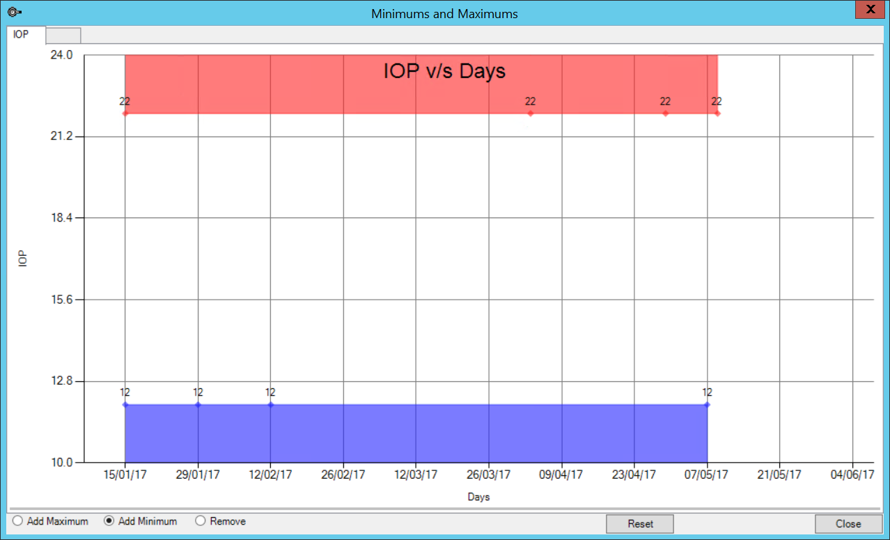
You can visually add upper and lower acceptable range boundaries to a graph. For example, if you are graphing intraocular pressure, you may consider any measurement below 12 and above 22 mm Hg to be outside the normal limits and requiring investigation. When the graph is displayed, you can instantly see whether a patient's IOP has crossed an upper or lower boundary.
- Open the Modify Graph Button screen for the graph.
- In the General tab, select 'Days', 'Weeks', or 'Months' from the Time Frame. You cannot use 'Visit Dates' as the default x-axis period if you want to apply a range boundary.
- Enter Start on and Number of values to define the starting time and intervals.
- Select Graph 1 or Graph 2 tab, whichever graph you are applying a range boundary to. Click High and Low Ranges. The Minimums and Maximums screen will appear blank. The example below shows a completed boundary range for IOP over Days.
- Select Add Maximum or Add Minimum in the lower left to add maximum or minimum range points. Left-click in the graph to insert a range point. A shaded area will be created between existing points and the new range point.
- Add range points incrementally to create a shaded area that represents the upper and lower acceptable ranges for the data series. Select Remove and left-click a range point diamond to remove the point from the graph.
- If you are satisfied with the range boundaries, click Close to save.

Click Reset to clear all points and start again.
Test a graph
To test how a graph looks:
- Create and save the graph on a UDF. The graph will be inserted as a button. Close the Form Designer.
- Open the containing UDF, depending on the type. For example, if the UDF is a Medical Desktop or subpage, press F11.
- Record some meaningful data in the graphed fields over two or more patient visits and save the record. It is good practice to use a 'dummy' patient record for testing purposes.
- Click the graph button to view the graph.